Hotel St. Cloud
Creative Direction
Graphic Design
Brand Development
Hotel St. Cloud, nestled in the heart of Cañon City, Colorado, has stood for over a century, weathering a full relocation and brick-by-brick reconstruction, a fire on its 4th floor, economic hardships, and more than anything, time. After its purchase at auction for just $80,000 in 2018, the team at Unbridled Hospitality embarked on an ambitious journey to transform this 132-year-old landmark into a luxury destination with two in-house restaurants and a speakeasy. Our team’s challenge was to create a brand that would honor the hotel's storied past, full of Wild West tales and larger-than-life personalities, while embracing its vibrant future. Our ultimate goal was to create a brand that positioned Hotel St. Cloud as the "living room of Cañon City," a place where the past and present converge, welcoming both locals and newcomers alike.
We dug deep into the history of Hotel St. Cloud and Cañon City, unearthing a cast of characters and a rich, storied past. From the daring exploits of actor Tom Mix and the Selig Polyscope Film Company to the ghosts that haunt the hotel’s upper floors, Hotel St. Cloud’s legacy is inextricably linked to the history of the region. Our creative team meticulously crafted a brand narrative that reflected these extraordinary stories, as well as the ambitions of its new owners. Every element, from postcards to wine labels to amenity cards, was designed to communicate how the hotel's rich history and bright future intertwine to create a place of respite, reflection, community, and connection.
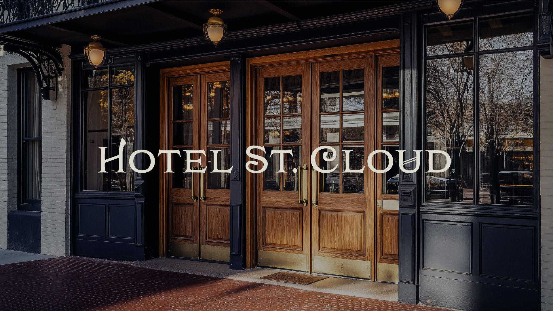
Logo and Supporting Marks: Coming into the project, Unbridled Holdings had developed a single mark for the hotel, its primary typography inspired by an archival advertisement displaying room rates for $2.50 a day and one of the hotel's original logos. We expanded the brand package to include a seal, brand icon, and horizontal iterations of the mark. The seal drew inspiration from Cañon City seals we found through the local historical society, while the brand icon was derived from decorative details found in period poster design.
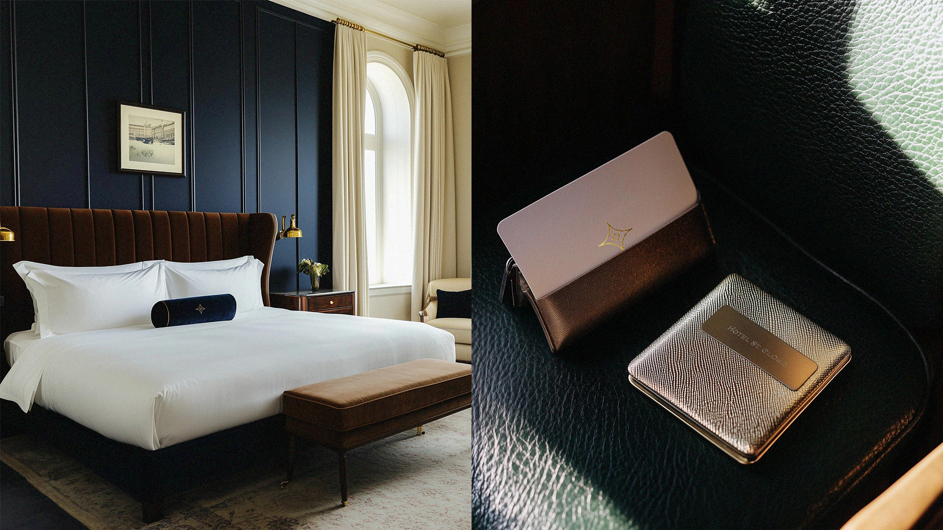
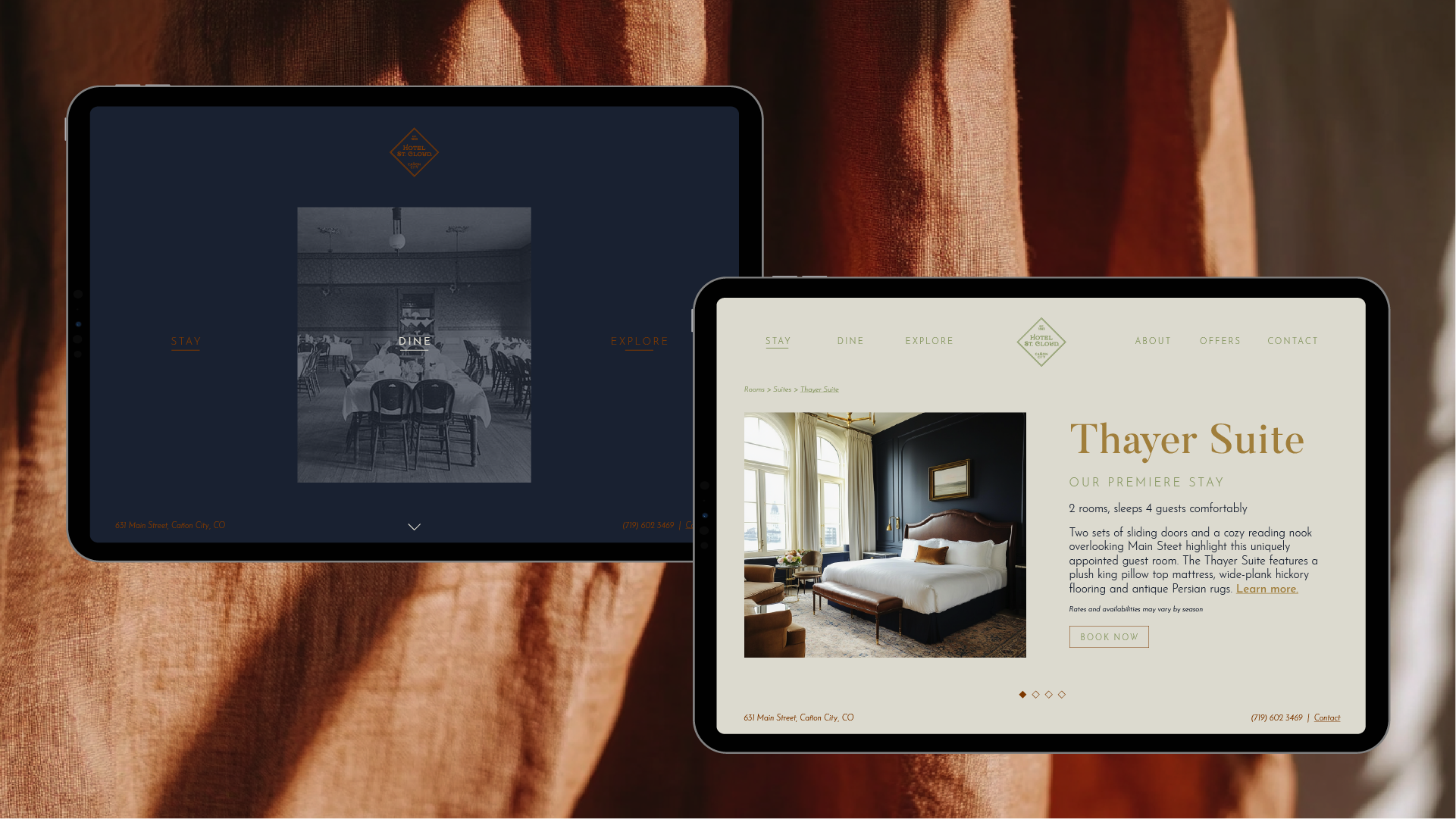
Color Palette: The color palette was developed to reflect the interior design of the hotel, pulling its gold and rust hues from the light reflecting off rich, polished wood, while sage was drawn from the velvet sofas in the lobby. The brand’s deep navy comes from the walls throughout the lower floors and suites, and cream provides a beautiful base, reminiscent of the light pouring through the lobby's floor-to-ceiling windows.
Typography: The typography, like the entirety of the brand, reflects a mix of antique and modern. Butler Pro, the brand’s headline type, is a mix of Dala Floa, originally inspired by worn headstone and shipping crate lettering, and Bodoni, an Enlightenment typeface that heavily influenced 19th-century printing. This vintage-inspired serif is paired with clean sans serif body type, working in harmony to communicate an elegance inspired by the past while remaining fresh for modern audiences.
Reference Materials
Brand Book


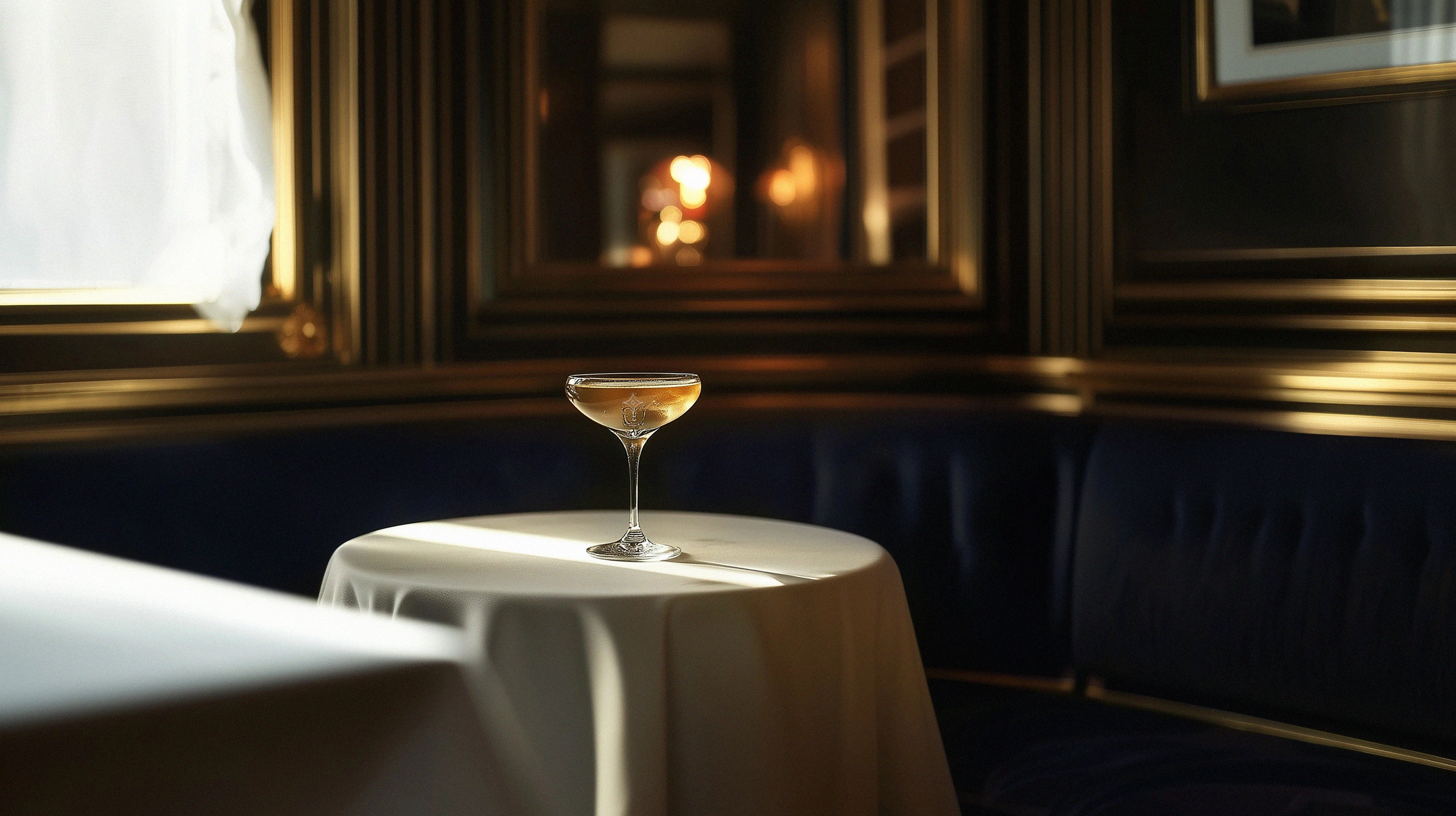
Photography: Historical photography was incorporated throughout the physical space and the brand itself. This approach showcased the authenticity of the hotel's story, guiding guests through its journey over time. The archival photography was used not just as filler but as a core design element, layered under type, the brand seal, and brand accents, adding texture and richness to the core brand elements. All current hotel photography was created using Midjourney, as the renovation and interior design of the property was still underway.
Messaging and Tone: Inspired by Unbridled Hospitality’s mission to "restore people and places," our messaging takes on the tone of an old friend: familiar and warm, trustworthy and steady. Coupled with the brand’s visuals, guests gain a sense of the refinement and luxury of the space, while feeling welcomed and valued.


