Capture Co
Creative Direction
Branding
Graphic Design
Image Styling and Curation
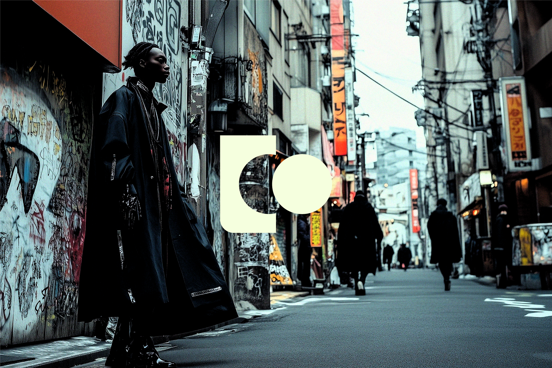
Capture Co’s primary ask was to create a brand that truly reflects their distinctive photography style. In addition, they wanted to incorporate the "Co" into their main mark and create a simple abstraction of a camera. Our vision for the Capture Co brand was then shaped by three core principles: the contrast of high fashion styling against rugged settings, the spontaneity and candid nature of street photography, and the consistent use of high-contrast palettes.
Starting with the logo, we drew inspiration from the form of modern instant cameras, particularly the Fujifilm Instax Square, known for its mix of squared and rounded edges. By distilling the camera down to its basic shapes, and then breaking them apart, we crafted the brand’s "Co" using the negative space in the mark. For the color palette, we sought a simple, high-contrast scheme that wouldn’t compete with the photographs. We opted for a light green and a dark gray to elevate and modernize a simple black and white palette. The addition of a grainy gradient further enhanced the contrast and added depth to the overall look.
Ultimately the branding of Capture Co blends the high-fashion, raw essence of their photography with a simple, sophisticated aesthetic. The thoughtful interplay of sleek vector shapes and grainy gradients, coupled with a distinct logo design, creates a compelling visual identity that is both contemporary and evocative. This approach ensures that Capture Co stands out in the photography industry, resonating with an audience that appreciates both style and substance.


